
To choose accent colors confidently, start by understanding color psychology to evoke the right mood. Use the color wheel to find complementary palettes that create contrast and harmony. Test small samples in your space, observing how they look under different lighting throughout the day. Consider your room size and lighting conditions to pick suitable hues, and aim for deliberate choices rather than guesswork. If you want to learn more, you’ll find practical tips to perfect your color selections.

Get everyday essentials delivered free with Prime
- Fast, free delivery on millions of items
- Prime Video, Amazon Music and more included
- Member-only deals all year
Key Takeaways
- Use the color wheel to identify complementary or contrasting hues for deliberate accent color choices.
- Test small samples in your space under different lighting conditions before committing.
- Consider the psychological impact of colors to evoke desired emotions and moods.
- Match accent colors with your main palette to ensure harmony and balance.
- Use online tools or palette generators to visualize how accent colors will look in your environment.

Are you struggling to select the perfect accent colors for your space? It’s a common challenge, but understanding some key principles can make the process much easier. Instead of relying on guesswork, you can use the science of color psychology and the harmony of complementary palettes to guide your choices. Color psychology helps you determine how different hues influence emotions and mood, so you can select accent colors that reinforce the atmosphere you want to create. For instance, if you aim for a calming environment, shades like soft blues or gentle greens work well. If you want to energize the room, consider vibrant reds or oranges. Knowing the emotional impact of colors allows you to make deliberate choices instead of random ones.
Using color psychology helps you choose accent hues that evoke the right mood and enhance your space intentionally.
Complementary palettes are another essential tool. They involve pairing colors that sit opposite each other on the color wheel, creating striking contrasts that draw the eye and add visual interest. For example, a soft beige with deep navy or a pale yellow with rich purple can create a balanced yet dynamic look. When choosing accent colors, look for hues that naturally complement your base wall or furniture colors. This method ensures harmony and avoids clashing, making your space feel cohesive. Instead of guessing which shades will work together, consult a color wheel or palette generator to identify complementary options. This approach saves you from the frustration of mismatched colors and helps you craft a polished, intentional look.
Additionally, consider the amount of space you’re working with. Smaller rooms benefit from lighter, more subdued accent colors to avoid feeling cramped, while larger areas can handle bolder, more saturated hues. Think about the lighting in your space too—colors can look very different under natural versus artificial light. Testing small swatches before committing to a color, placing them in the room to see how they look throughout the day, is a crucial step in the process. This step prevents costly mistakes and gives you confidence in your choices. Being aware of color perception under different lighting can further refine your selections. Incorporating color psychology into your decision-making process can help you select shades that evoke specific feelings and enhance your overall design. Ultimately, understanding how color perception influences how we experience a space can help you make more informed decisions. Ultimately, choosing accent colors doesn’t have to be a guessing game. By applying color psychology to understand emotional effects and using complementary palettes to create visual harmony, you can select shades that enhance your space deliberately. Take your time, experiment with small samples, and trust these proven principles to guide your decisions. With a thoughtful approach, your accents will beautifully complement your overall design, making your space feel intentional and inviting.
color palette generator for interior design
As an affiliate, we earn on qualifying purchases.
As an affiliate, we earn on qualifying purchases.
Frequently Asked Questions
How Do I Ensure Accent Colors Complement My Existing Decor?
To guarantee your accent colors complement your existing decor, consider accent color psychology and cultural color meanings. Choose hues that evoke the mood you want—calm, energy, or sophistication—while respecting cultural associations. Test small swatches in your space to see how they interact with your current palette. This approach helps you make confident choices, creating a harmonious look that feels intentional and visually appealing.
What Tools Can Help Me Visualize Accent Color Options?
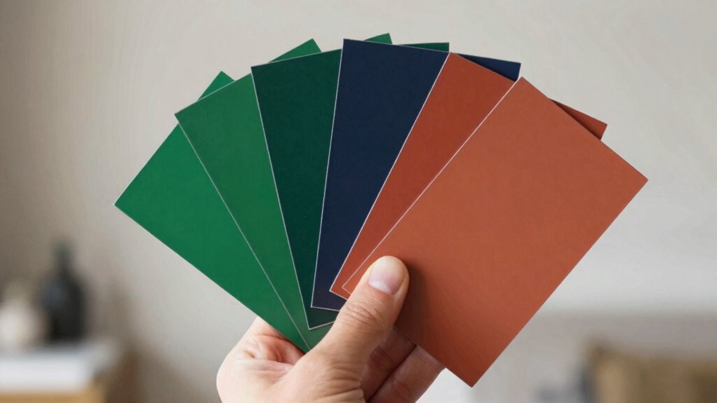
You can easily explore your options with tools like color swatches and digital mockups. Color swatches let you hold vibrant samples against your decor, giving a tactile sense of harmony. Digital mockups, on the other hand, offer a virtual preview, blending your chosen accent colors seamlessly into your space. These tools help you visualize the perfect splash of color before making a commitment, ensuring your choices truly shine.
How Many Accent Colors Should I Choose for a Balanced Look?
You should choose two to three accent colors for a balanced look. This allows you to incorporate different shades while maintaining harmony. Consider color psychology to select hues that evoke the desired emotions and use color contrast to make your accents pop without overwhelming the space. Limiting your accents prevents visual clutter, helping your room feel cohesive and thoughtfully designed.
Can Accent Colors Change the Mood of a Room?
Of course, accent colors wield the power to transform a room’s mood—think of them as tiny mood architects. By applying color psychology, you can boost energy, calm nerves, or evoke sophistication. Want a lively vibe? Opt for vibrant reds or yellows. Craving serenity? Soft blues or greens will do the trick. Accent colors aren’t just decorative; they’re your secret weapon for mood enhancement, ingeniously manipulating ambiance with just a splash.
How Do I Select Accent Colors for Small Spaces?
To select accent colors for small spaces, consider color psychology to create the desired mood. Opt for bold or contrasting accent colors to add visual interest without overwhelming the room. Use accent color contrast strategically, such as pairing a vibrant hue with neutral walls, to make the space feel lively yet balanced. Keep it simple, and choose colors that complement your main palette for a harmonious look.
Conclusion
Think of choosing accent colors like tending a garden. You plant your base hues carefully, then select vibrant blooms to add contrast and charm. With patience and a keen eye, you’ll nurture a balanced palette that grows naturally and beautifully. Trust your instincts, experiment thoughtfully, and soon your space will flourish with color harmony—each accent a deliberate bloom, enhancing the overall landscape without guesswork. Your design garden is now in full, vibrant bloom.
Halloween Picks
halloween
As an affiliate, we earn on qualifying purchases.