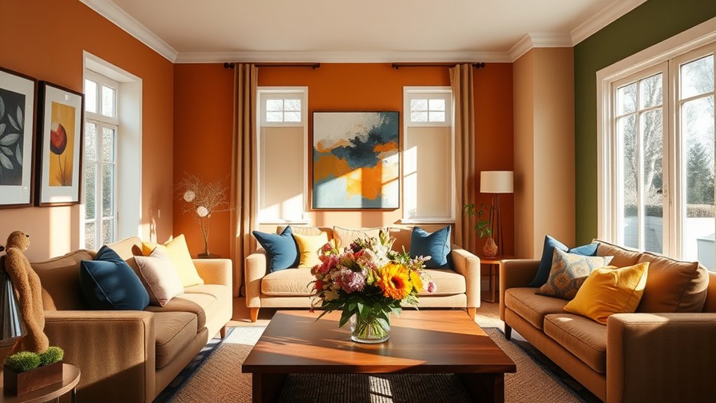
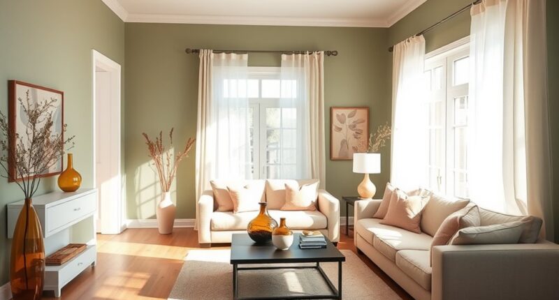
To create a harmonious 2025 home palette, focus on earthy tones like warm taupes, olive greens, and terracotta, which connect to nature and foster calm. Incorporate natural materials such as wood, stone, and linen to add texture and authenticity. Use soft shades like sage for serenity and warm hues for coziness, while bright accents energize the space. Consider lighting and contrast to enhance your colors. Explore this guide to discover how to achieve the perfect mood and style.
Key Takeaways
- Incorporate warm earthy tones like beiges, terracotta, and rich browns to foster a cozy, natural atmosphere.
- Use natural materials such as wood and stone to enhance authenticity and complement earthy color palettes.
- Select soft, calming shades like sage green to create serene spaces, while bright accents add energy and personality.
- Consider lighting conditions to ensure colors appear as intended and enhance mood; natural light emphasizes earthy hues.
- Experiment with color contrast and accent walls to add depth, dimension, and harmony to your overall home design.

Selecting the right color palette for your home sets the tone for your entire space, and 2025 offers exciting trends to inspire your choices. This year, warm and earthy tones take center stage, creating a cozy, inviting atmosphere that emphasizes comfort and stability. Think shades like rich browns, beiges, and warm taupes that ground your rooms and foster a sense of calm. These colors aren’t just stylish—they connect you to nature, reflecting a broader trend of integrating natural elements into home design. You’ll find natural materials like wood and stone becoming more prominent, enhancing that authentic, earthy vibe. Colors inspired by landscapes and vegetation—such as olive greens and warm terracotta—bring the outdoors inside, making your space feel both fresh and harmonious. Plus, using these earthy hues aligns with a desire for sustainability, emphasizing natural and eco-friendly materials. Additionally, understanding color accuracy and how it affects visual perception can help you choose hues that truly complement your space and lighting conditions. Data plays a significant role in guiding your color choices. Pinterest, for example, uses search patterns and user preferences to predict upcoming trends, helping you stay ahead of the curve. By analyzing consumer behavior and visual search technology, you can identify emerging color palettes that resonate with your style. This data-driven approach guarantees that your selections aren’t just based on fleeting fads but are rooted in what’s popular and meaningful right now. Incorporating visual perception considerations can further ensure your chosen colors look their best in your specific lighting environment, making your space feel cohesive and intentional. Moreover, experimenting with color contrast can add depth and dimension to your rooms, preventing them from feeling flat or monotonous. As you consider your options, think about how colors influence your mood. Soft shades like sage green, exemplified by HGTV’s Quietude, evoke serenity and relaxation—perfect for bedrooms or calming living spaces. Warm hues such as cinnamon slate or mocha mousse add depth and a cozy feel, making your rooms more inviting. Bright, richer tones like golden mustard and deep ruby red can be used as accent colors to inject energy and personality, creating visual interest without overwhelming the space. In 2025, the bold trend of color drenching also gains popularity—using one dominant color throughout a room to make a powerful statement. More than half of industry experts agree that monochromatic schemes are an effective way to achieve a cohesive, modern look. Whether you opt for a full room in a soft sage or a deep ruby accent wall, this approach simplifies your palette while maximizing impact. Remember, the key to a successful color palette isn’t just choosing trendy shades but understanding how each hue affects mood and harmony. Personal preference matters—select colors that resonate with you and reflect your emotional needs. When you combine natural inspiration with data insights and a clear understanding of color psychology, you’ll craft a space that’s both beautiful and emotionally fulfilling. Additionally, incorporating natural materials like linen and reclaimed wood can enhance the earthy aesthetic and provide tactile warmth to your decor. Proper lighting also plays a crucial role in how these colors appear, so consider the natural light in your space when selecting your palette.

4MP Dual Lens Home Security Camera System Wireless, Security Cameras Wireless Outdoor 24/7 Record, Auto Tracking, 5G & 2.4G WiFi, Night Vision, 2-Way Audio, 360° PTZ, 10CH 4K NVR 500GB No Subscription
【Dual-Lens System:Get the 360° Coverage of 2 Pro Cams for the Price of 1】Unlike any single-lens camera that...
As an affiliate, we earn on qualifying purchases.
Frequently Asked Questions
How Do I Select Colors That Reflect My Personality?
When selecting colors that reflect your personality, start by identifying traits you want to express. If you’re energetic, consider bold hues like reds or oranges. For calmness, opt for blues or whites. Choose colors that resonate with your emotional state and personal style. Use natural light to see how they change throughout the day. Trust your instincts and experiment with swatches or digital tools to find the perfect palette that truly represents you.
What Are the Best Color Combinations for Small Spaces?
Imagine your small space as a cozy garden; the right color combo helps it flourish. Soft whites like Swiss Coffee brighten, while neutral grays like Natural Linen add cohesion. Earth tones bring warmth, and soothing greens like Quietude create calm. Use deep charcoals for contrast, and vibrant greens or sun-drenched tones for energy. Balance bold accents with neutral backgrounds for harmony, making your space feel inviting and well-designed.
How Can I Incorporate Trends Without Overhauling My Decor?
You can incorporate trends into your decor by adding accent pieces in earthy tones like Cinnamon Slate or rich contrasts like Ruby Red. Keep your neutral backgrounds intact, so new colors stand out without overwhelming. Use natural elements to enhance the space, and layer shades for depth. This approach lets you stay current while maintaining your personal style, creating a harmonious, inviting environment that feels fresh yet timeless.
What Are Tips for Balancing Bold and Neutral Colors?
Did you know that using the 70-30 rule creates a balanced and harmonious space? To balance bold and neutral colors, start with neutral walls and add bold accents through furniture or accessories. Use layered lighting and dimmers to enhance colors, and introduce bold hues gradually. Keep a neutral background to prevent overwhelming the room, and guarantee your bold choices reflect your personality for a cohesive, inviting atmosphere.
How Do Lighting Conditions Affect Color Choices?
Lighting conditions greatly influence your color choices by altering how colors appear. Natural light makes cool tones pop in the morning but can wash out warm hues. Artificial lighting, like LEDs or incandescents, enhances specific colors, affecting mood and perception. You should test your colors under different lighting to see how they look throughout the day. This way, you guarantee your chosen palette creates the desired atmosphere consistently.

SOLIOM- 5MP Security Cameras Wireless Outdoor, No Subscription & Solar Powered,4-Cam Pack Cameras for Home Security with 360° Auto Motion Tracking, 3K Color Night Vision,5G & 2.4G Router Compatible
5MP Ultra HD Video with Unique Magnifier Zoom – The Soliom 5MP outdoor security camera delivers clear, vibrant...
As an affiliate, we earn on qualifying purchases.
Conclusion
So, go ahead and pick that daring hue or stick with safe neutrals—after all, who needs harmony when you can have a conversation starter? Remember, your home’s color palette is your chance to make a statement… or just confuse your guests. Either way, embrace the chaos or calm; just don’t blame us when your walls become the talk of the town (or the reason for a quick repaint). Happy decorating!

Blink Outdoor 4 – Wireless smart security camera, two-year battery life, 1080p HD day and infrared night live view, two-way talk. Sync Module Core included – 2 camera system
Outdoor 4 is our most affordable wireless smart security camera yet, offering up to two-year battery life for...
As an affiliate, we earn on qualifying purchases.

Blink Outdoor 4 – Wireless smart security camera, two-year battery life, 1080p HD day and infrared night live view, two-way talk. Sync Module Core included – 3 camera system
Outdoor 4 is our most affordable wireless smart security camera yet, offering up to two-year battery life for...
As an affiliate, we earn on qualifying purchases.


