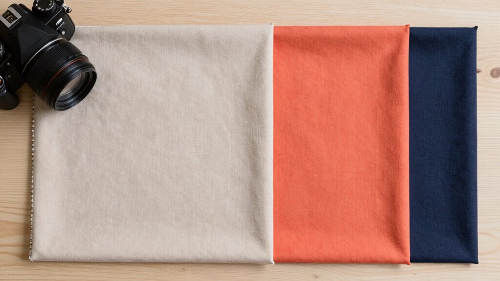

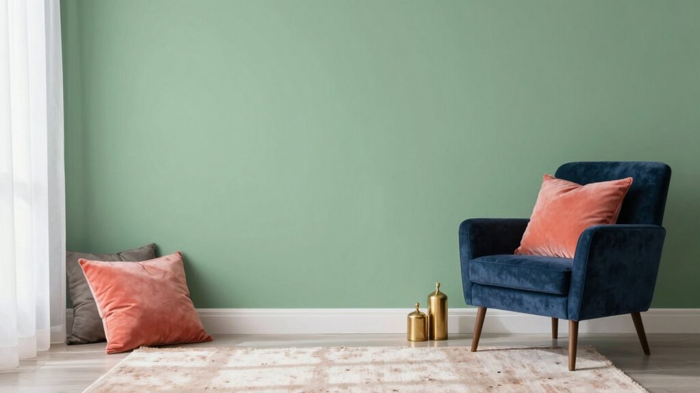
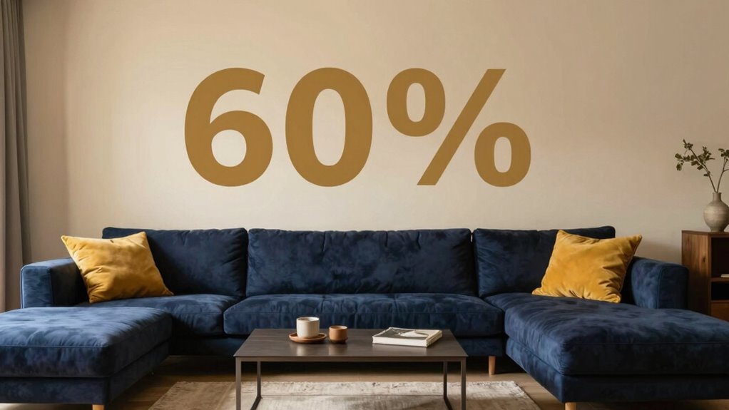
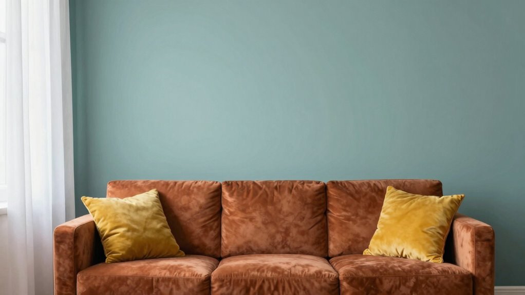
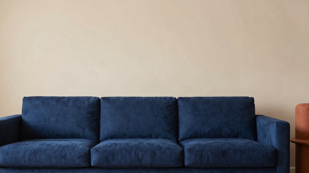
To pick a color palette using the 60-30-10 rule, start by choosing a dominant hue that sets the mood, covering about 60% of your space. Next, select a secondary color for contrast, making up around 30%, and finally add a small pop of accent color at 10% to highlight key elements. Balancing these proportions helps create harmony and visual interest. Keep experimenting with your choices, and you’ll find your perfect palette waiting to be revealed.
Key Takeaways
- Start with selecting a dominant color that sets the mood, covering about 60% of your palette.
- Choose a secondary color that contrasts or complements the dominant, making up around 30%.
- Use an accent color sparingly (about 10%) to highlight focal points and add visual interest.
- Balance warm and cool tones, and incorporate neutrals for harmony and flexibility in your palette.
- Adjust the ratios based on your desired emotional impact, increasing or decreasing proportions to suit your design goals.

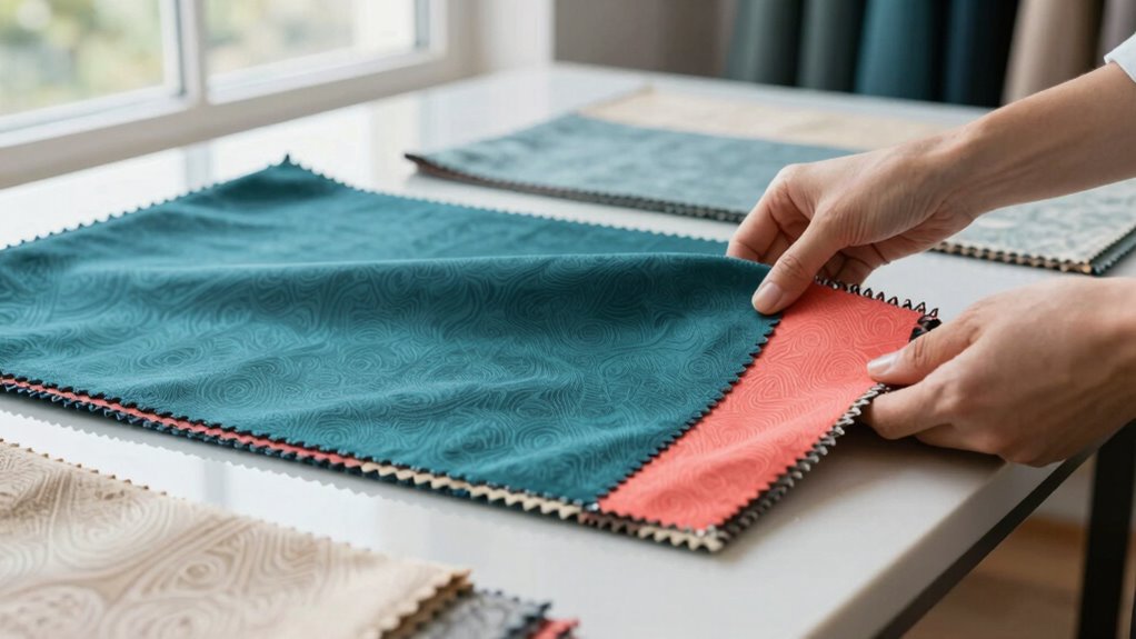
VICASKY Architecture Paint Color Cards Professional Color Matching Tool Paint Sample Cards Fan Deck for Contrast Painting Tools for Drawing and DIY Projects 1 Set
- Color Matching Tool: Includes 258 standard architectural colors
- Portable Fan Deck: Compact, easy-to-carry design for portability
- Standard Color Reference: Provides clear visual color comparison
As an affiliate, we earn on qualifying purchases.
As an affiliate, we earn on qualifying purchases.
What Is the 60-30-10 Rule and Why It Matters
The 60-30-10 rule is a simple guideline that helps you create balanced and visually appealing color palettes. It’s especially useful because it considers how color psychology influences perception and mood. When choosing your colors, you’ll use 60% of a dominant hue, 30% of a secondary color, and 10% for accents. Cultural influences also shape how different colors are perceived, so understanding your audience’s background can guide your choices. This rule simplifies decision-making, making sure your design feels harmonious without overwhelming viewers. By respecting proportions, you create a cohesive look that resonates emotionally and culturally. Additionally, understanding the color psychology behind your palette can enhance the overall impact of your design. Recognizing how different hues evoke specific emotional responses can help you tailor your palette to communicate your intended message more effectively. Whether designing a room or a brand, the 60-30-10 rule ensures your palette communicates effectively while maintaining visual balance.
How the 60-30-10 Ratio Creates Visual Balance
Applying the 60-30-10 rule creates a natural sense of harmony in your design by distributing colors in proportions that feel balanced to the eye. This ratio ensures that the dominant color covers 60%, establishing a strong foundation for color harmony and setting the overall mood. The secondary color, at 30%, complements the primary, adding contrast without overwhelming. The accent color, used in 10%, provides visual interest and focal points. This deliberate distribution fosters visual stability, preventing any one color from overpowering the others. As a result, your design feels cohesive and balanced, guiding viewers smoothly across the space. Incorporating understanding of color balance in visual design can further enhance the effectiveness of your palette choices, helping you achieve visual harmony and a more engaging aesthetic.
How to Choose Your Dominant Color (60%)
Choosing your dominant color is a crucial step in creating a balanced palette, as it sets the overall tone of your design. Consider how color psychology influences emotions and perceptions—calm blues evoke tranquility, while vibrant reds energize. Seasonal palettes can guide your choice; for instance, warm autumn tones or cool winter shades. When selecting your dominant color, think about:
- The mood you want to convey
- The setting or season you’re designing for
- How the color aligns with your brand or theme
- Its versatility to pair with accent hues
Your dominant color should be something you love and that fits the context of your project. This foundation ensures your palette feels cohesive, intentional, and appealing. Understanding color theory can help you make more deliberate choices that enhance your overall design, especially considering color harmony techniques.
How to Pick Accent Colors (30% and 10%) for Interest
Choosing the right accent colors can add depth and interest to your palette. Focus on selecting complementary hues and balancing warm and cool tones to create visual harmony. Use these accents strategically to highlight focal points and keep your design engaging. Incorporating color harmony principles can also introduce a sense of openness and spontaneity that enhances the overall aesthetic.
Choosing Complementary Accent Colors
Selecting the right accent colors can instantly elevate your color palette by adding depth and visual interest. To achieve harmony and contrast, choose accent colors that complement your primary hue. Complementary colors, located opposite each other on the color wheel, create vibrant accent contrast that energizes your space. When selecting these accent colors, consider their relationship to your main color to maintain color harmony. Use these ideas as a guide:
- Pick colors that are directly opposite for vivid contrast
- Use shades and tints of your primary color for subtlety
- Balance bold accent colors with neutral 10% accents
- Ensure contrast enhances without overwhelming the main palette
- Proper navigation and mapping principles can help visualize how these colors work together in your space, making it easier to apply color harmony principles effectively. Understanding color relationships can also guide you in creating a balanced and appealing palette. Exploring visualization techniques can further assist in planning your color scheme before implementation. Incorporating color psychology can also influence the emotional impact of your palette, ensuring it aligns with your desired mood.
This approach guarantees your accents stand out while maintaining overall harmony, making your color scheme visually compelling.
Balancing Warm and Cool Tones
Balancing warm and cool tones is essential for creating a dynamic and inviting color palette. It guarantees visual harmony by blending contrasting color temperatures effectively. To achieve this, you can mix warm hues like reds and yellows with cool shades such as blues and greens. The key is to maintain proportion, often using the 60-30-10 rule, where the dominant color sets the tone, and accents add interest. Understanding color temperature helps in selecting and balancing these hues for a cohesive look.
Using Accent for Focal Points
To create visual interest and draw attention to specific areas, you need to pick the right accent colors. These accent focal points add dynamic color emphasis, guiding the viewer’s eye where you want it most. Choose a bold or contrasting hue that stands out against your primary palette. For example, if your main color is blue, a splash of orange can create striking emphasis. Use the 30% and 10% areas wisely to highlight key features without overwhelming the design. Consider these ideas for effective accent color use:
- Select a hue with high contrast to your base color
- Limit the number of accent colors to avoid clutter
- Use accent colors for focal points like artwork or furniture
- Apply sparingly in small, strategic areas for maximum impact
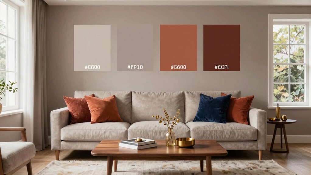
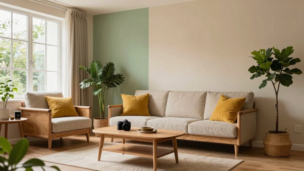
Applying the 60-30-10 Rule in Interior, Web, and Graphic Design

The 60-30-10 rule offers a simple yet effective way to create visually balanced and appealing color schemes across interior, web, and graphic design projects. By applying this rule, you establish strong color harmony that guides the viewer’s eye and enhances emotional impact. Start with your dominant color, occupying 60%, which sets the mood and overall tone. Next, select a secondary color for 30%, adding contrast and depth without overwhelming. Finally, introduce an accent color at 10% to highlight key elements and evoke specific emotions. Whether designing a room, a website, or a logo, this approach guarantees your color choices work together seamlessly, creating a cohesive visual experience that resonates emotionally with your audience.
Common Mistakes to Avoid When Using the 60-30-10 Color Rule
While the 60-30-10 rule provides a straightforward framework for creating harmonious color schemes, many people make common mistakes that can undermine its effectiveness. One mistake is ignoring color contrast, which can make elements hard to distinguish or cause visual fatigue. Another is misjudging mood creation, where incorrect color choices can evoke unintended emotions. Overusing the dominant color can overwhelm the space, while neglecting accent colors reduces visual interest. Additionally, relying solely on the ratio without considering how colors interact can lead to unbalanced designs. To avoid these issues, guarantee your primary color provides sufficient contrast, choose accents that support your desired mood, and test how colors work together before finalizing your palette. Understanding color interaction is essential to creating balanced and visually appealing schemes that resonate with viewers.
Tips for Selecting Harmonious Colors Within the Ratio
To create a balanced color palette, start by mixing bright hues with neutral tones to avoid visual overload. Incorporate complementary shades that enhance each other without clashing, ensuring harmony. By thoughtfully combining these elements, your color scheme will feel cohesive and pleasing to the eye. Additionally, understanding color psychology can help you select colors that evoke the desired mood and atmosphere in your design.
Balance Bright and Neutral
Balancing bright and neutral colors is essential for creating a harmonious palette that feels both lively and grounded. You should consider color psychology and cultural associations to guarantee the hues work well together. Bright colors can energize a space, but too much may overwhelm; neutrals stabilize the palette. To achieve this balance, keep these ideas in mind:
- Use neutrals as a backdrop to allow bright accents to stand out.
- Select neutrals with warm or cool undertones that complement your bright shades.
- Incorporate cultural associations to evoke specific feelings or themes.
- Adjust the ratio if needed, making sure neutrals dominate for a soothing effect while bright colors add pops of interest.
- Exploring sound healing science can inspire calming color choices that promote relaxation and balance in your space. Additionally, understanding color harmony principles can help you create a more cohesive and pleasing palette.
This approach ensures your palette feels cohesive, engaging, and culturally resonant.
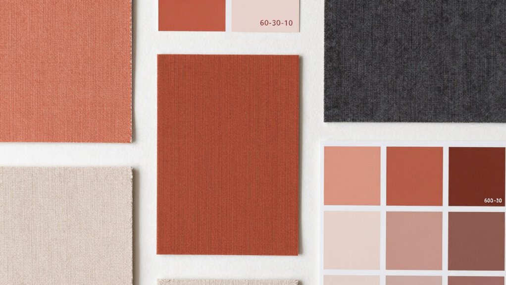
Use Complementary Shades
Choosing complementary shades is a powerful way to create a harmonious color palette, especially when working within a balanced ratio of bright and neutral hues. Complementary shades sit opposite each other on the color wheel, enhancing each other’s vibrancy and adding depth. When selecting these shades, aim for a mix that balances contrast with cohesion, strengthening overall color harmony. Use the table below to understand pairing options:
| Bright Shade | Neutral Complement |
|---|---|
| Blue | Warm beige |
| Red | Soft gray |
| Green | Creamy white |
This approach guarantees your palette feels lively yet grounded, making your space or design visually appealing and well-balanced.
How to Adjust the 60-30-10 Rule for More Dynamic or Subtle Palettes
While the classic 60-30-10 rule provides a solid foundation for color harmony, adjusting these proportions can help you create more dynamic or subtle palettes. To boost color contrast and influence mood creation, consider shifting the balance. For a more vibrant and energetic look, increase the dominant color to 70%, and reduce accents to 20% and 10%. For a softer, more subdued atmosphere, reduce the dominant color to 50%, with secondary and accent shades sharing the remaining 50%. You can also experiment with:
- Using a bold accent color in smaller amounts for striking contrast
- Incorporating neutral tones to tone down intensity
- Balancing warm and cool hues for nuanced mood creation
- Varying proportions based on the emotional impact you desire
- Understanding design principles can help you better tailor your palette’s mood and visual impact.
Final Tips: Testing and Refining Your Color Palette for Maximum Impact
Once you’ve adjusted your color proportions to match the mood you want, the next step is to test and refine your palette to guarantee maximum impact. Start by applying your colors in real-world contexts, like your design or space, and observe how they work together. Check for color harmony—do the hues feel balanced and pleasing? color harmony can be influenced by subtle variations in shade or saturation, so pay close attention to how each element interacts. Ensure visual consistency by maintaining a cohesive look across different elements. Don’t be afraid to tweak shades or proportions if something feels off; small adjustments can markedly improve overall harmony. Use feedback from others and trust your own instincts. Repeated testing and refinement help you fine-tune your palette, creating a harmonious and impactful design that resonates with your audience. Additionally, understanding color psychology can help you select shades that evoke the desired emotional response.
Frequently Asked Questions
Can the 60-30-10 Rule Apply to Monochromatic Color Schemes?
Yes, the 60-30-10 rule can apply to monochromatic harmony by using subtle variations of a single color. You’ll allocate 60% of the space to the dominant hue, 30% to its lighter or darker shades, and 10% to accent pieces. This approach creates a balanced, cohesive look through subtle variations, making your monochromatic palette feel harmonious and visually interesting without overwhelming the senses.
How Do Lighting Conditions Affect the Color Ratios?
Lighting impact profoundly influences your color ratios, whether you’re using natural or artificial light. Natural light can make colors appear brighter and more vibrant, often requiring you to adjust ratios slightly to avoid overwhelming your space. Artificial light, on the other hand, may cast warm or cool tones that alter your color balance. To achieve harmony, observe how lighting affects your palette throughout different times of day and adjust accordingly.
Is the 60-30-10 Rule Suitable for All Design Styles?
Like a trusty compass in uncharted waters, the 60-30-10 rule isn’t a one-size-fits-all for every design style. You might find it perfect for creating color harmony and aesthetic balance, but some styles—like eclectic or boho—benefit from more flexible palettes. Use it as a guideline rather than a strict rule, adapting it to suit your unique vision and ensuring your design reflects your personal flair.
How Do I Adapt the Rule for Digital Versus Print Media?
For digital adaptation, you should prioritize bright, vibrant colors that display well on screens, adjusting the 60-30-10 rule to emphasize your dominant color more prominently. In print considerations, remember that colors may appear softer or different due to printing inks and paper quality. You might need to tweak your palette slightly, ensuring your colors stay true and consistent across both media, maintaining visual harmony and brand identity.
Can the Rule Be Modified for Seasonal or Thematic Designs?
Imagine your color palette as a wardrobe; you’d switch out seasonal variations and thematic adaptations to match the occasion. Yes, you can modify the 60-30-10 rule for different themes or seasons. For example, use more vibrant colors for summer or softer tones for winter. Adjust the proportions to highlight seasonal or thematic elements, making your design feel fresh and relevant without losing balance.
Conclusion
By mastering the 60-30-10 rule, you can create color palettes that feel balanced and intentional, like a well-tuned symphony. Remember, it’s a flexible guide, not a strict rule—adjust it to suit your style and project needs. Test different combinations and refine until your colors harmonize perfectly. With practice, your designs will stand out beautifully—like a vibrant garden in full bloom, eye-catching and perfectly composed.