Understanding color theory helps you design home interiors that look harmonious and feel inviting. By considering color psychology, you can choose shades that set the right mood—calm blues for relaxation or energetic reds for excitement. Combining complementary colors creates striking contrasts and visual interest, while lighting influences how colors appear. Balancing these elements ensures your space reflects your personality and style. Keep exploring to discover more tips for mastering color harmony in your home.
Key Takeaways
- Use color psychology to select hues that evoke desired moods, such as calming blues or energizing reds.
- Implement complementary color schemes by pairing opposite colors for visual interest and balance.
- Consider lighting conditions, as natural and artificial light influence how colors appear in different spaces.
- Balance bold accents with neutral or calming base colors to create harmonious and inviting interiors.
- Incorporate color accents through accessories to add contrast and personality without overwhelming the space.

Understanding color theory is essential for creating a harmonious and inviting home interior. When you grasp how colors influence mood and perception, you can craft spaces that feel both balanced and inspiring. One key aspect is color psychology, which explores how different hues affect your emotions and behaviors. For example, soft blues and greens evoke calmness and relaxation, making them perfect for bedrooms or quiet areas. Bright reds and yellows energize a space, ideal for kitchens or lively gathering spots. By understanding these psychological effects, you can choose colors that foster the atmosphere you desire in each room.
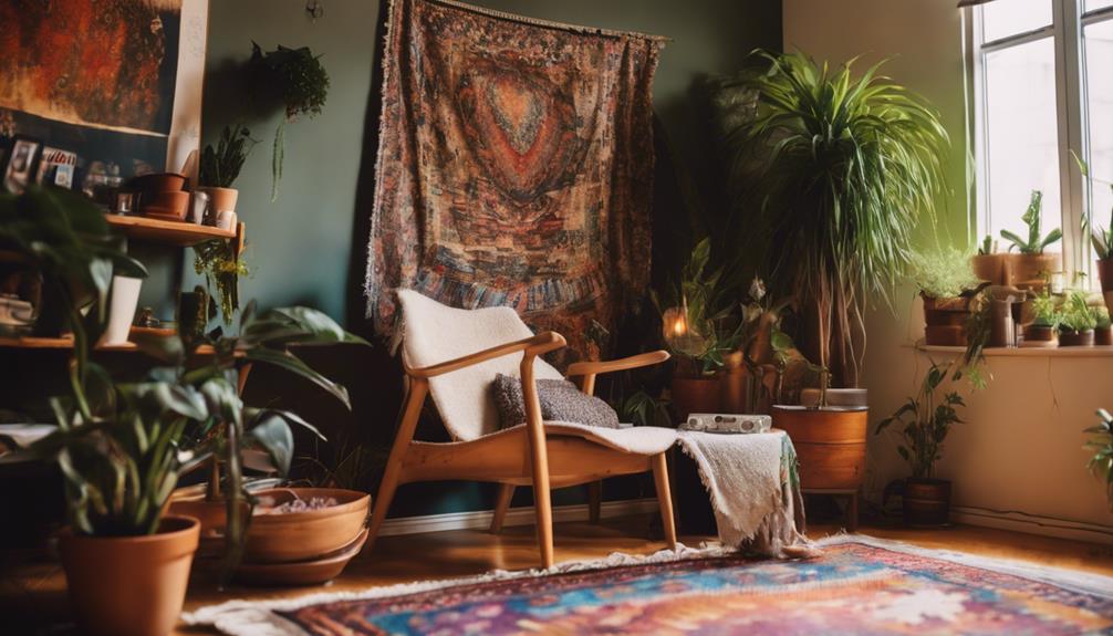
Complementary color schemes are another powerful tool in your decorating arsenal. These schemes involve pairing colors that sit opposite each other on the color wheel, creating striking contrasts that are visually appealing. For instance, combining navy blue with warm orange or emerald green with rich red can produce vibrant, dynamic spaces. When you use complementary colors thoughtfully, you add depth and interest to your interiors without overwhelming the senses. To keep it balanced, consider using one color as the dominant hue and the other as an accent. This approach prevents the space from feeling too chaotic or discordant.
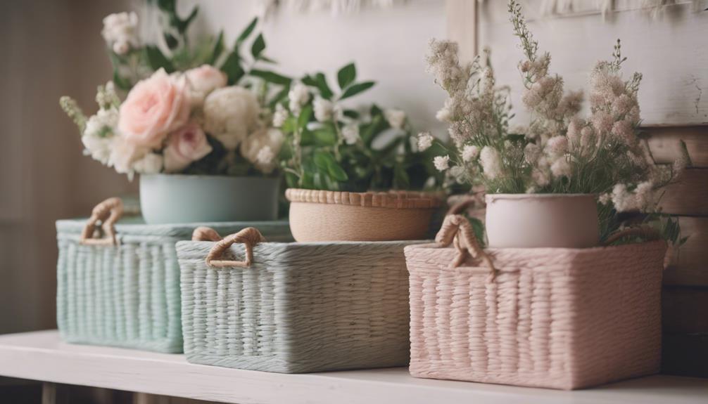
In practice, integrating color psychology with complementary schemes allows you to design rooms that are both engaging and emotionally supportive. For example, in a living room, you might choose a calming blue as the primary wall color and add accents in a complementary warm orange or coral. This pairing not only creates visual interest but also balances energy and tranquility. If you prefer a more subtle look, you can incorporate these contrasting colors through accessories like pillows, artwork, or rugs rather than painting entire walls. This way, you get the benefits of color psychology and complementary schemes without making the space overwhelming.
You should also remember that lighting plays a significant role in how colors appear in your home. Natural light can enhance cooler shades, making them feel more invigorating, while warm lighting can soften or deepen warmer hues. When selecting your color schemes, consider the amount of natural light each room receives to ensure the colors look just right. Additionally, keep in mind that personal preferences and the existing furnishings influence your choices. Ultimately, mastering the basics of color psychology and complementary color schemes empowers you to create interiors that are not only beautiful but also feel right for you. When you align your colors with your desired mood and aesthetic, your home becomes a true reflection of your personality and style.
Furthermore, understanding interior color harmony can help you create cohesive spaces that flow seamlessly from room to room, enhancing overall comfort and aesthetic appeal.

Color: Natural Palettes for Painted Rooms
As an affiliate, we earn on qualifying purchases.
As an affiliate, we earn on qualifying purchases.
Frequently Asked Questions
How Can I Incorporate Bold Colors Without Overwhelming My Space?
To incorporate bold colors without overwhelming your space, start with bold accents like pillows, artwork, or rugs. These add vibrant touches while maintaining color balance. Use neutral walls and furniture to create a calm backdrop, allowing your bold accents to stand out without overpowering the room. Keep the overall palette cohesive and limit the number of bold colors to make sure your space feels lively yet balanced and inviting.
What Are the Best Color Schemes for Small Rooms?
For small rooms, opt for light, neutral colors to create an open feel, enhancing color harmony and making the space look larger. Incorporate soft shades like pastels or warm neutrals, which align with positive color psychology, to evoke calmness and comfort. Add accent pieces in bolder hues to introduce interest without overwhelming. Keep furniture and decor simple, and use mirrors to reflect light, maximizing the sense of space.
How Do I Choose Colors That Affect Mood Positively?
To choose colors that positively affect your mood, consider their psychological effects and cultural associations. You’re likely to feel calmer with soft blues or greens, which promote tranquility, while warm yellows and oranges boost energy and happiness. Think about how different colors resonate with you personally and culturally, then select hues that evoke the positive feelings you want to foster in your space. Trust your instincts and experiment to find what feels best.
Can Color Theory Help Improve My Room’s Lighting?
Yes, color theory can help improve your room’s lighting by enhancing lighting perception and creating a brighter, more inviting space. You can choose colors that reflect or absorb light strategically, making your room feel more illuminated. Light shades like whites and pastels boost lighting enhancement, while darker tones can create cozy atmospheres. By understanding how colors influence perception, you can optimize your room’s lighting for both function and mood.
What Are Common Mistakes to Avoid in Color Coordination?
Imagine choosing a bright red wall with orange accents, creating a color clash that feels overwhelming. To avoid mistakes like incorrect color pairing, stick to a color wheel and select harmonious shades. Be cautious of overusing bold hues, which can lead to visual chaos. Test paint samples before committing, and balance vibrant colors with neutral tones. These steps help you prevent common mistakes in color coordination and create a cohesive space.
Conclusion
Now that you’ve got the scoop on color theory, you’re ready to transform your home into a vibrant sanctuary. Remember, choosing the right hues can make your space feel larger, cozier, or more energetic—like a modern-day Renaissance painting. Don’t be afraid to experiment and trust your instincts. With a little bit of Adobe Photoshop-inspired magic, you’ll create a home that’s truly your masterpiece. So go ahead, paint your world with confidence!